Shape is one of the Elements of Art. A shape is created when the ends of a line meet, forming an enclosed area. Shapes can be structured and geometric, like squares and circles, or organic, like leaves or brush strokes. The edge of a shape can be hard or soft/blurred.
Our images are usually made up of many shapes. Squares and rectangles can “feel” hard and rigid, while curves often create a sense of calm or may depict a journey. The shapes we incorporate into our images and how we place them within our composition, determines how they will be received by the viewer.
ELEMENTS OF ART – SHAPE VS FORM
The elements, Shape and Form, are often confused. Shape is generally considered two-dimensional, while Form is three-dimensional. In photography, how we light an object can determine whether it’s perceived as a shape (if the lighting is flat or silhouetted) or a form (if the lighting has accentuated shadows & highlights to create depth).
WHY THE ELEMENTS OF ART & PRINCIPLES OF DESIGN ARE IMPORTANT
We are exploring the Elements of Art to better understand their role in composition. With a greater understanding, we can create stronger imagery and enhance the viewer’s connection with our photography.
Elements of Art: line, colour, shape, form, texture, value and space
Principles of Design: balance, movement, pattern, repetition, rhythm, proportion, variety, emphasis, contrast
Here are some examples of applying the Principles of Design to some Elements of Art. We can use:
- line (element) to express movement (principle);
- colour (element) to convey balance/harmony (principle);
- texture (element) to create emphasis (principle);
- and shape (element) to create contrast (principle) within the frame.
Note, when we refer to “contrast” in the art theory context, think “difference” rather than punchy vs flat tonal range.
USING SHAPE IN PHOTOGRAPHY
Shape elements are often found in photography in the form of patterns. They can also be use to draw emphasis to part of the frame. Shapes can create contrast between the subject and their environment. These are just some of the uses.
SHAPE AS CONTRAST – SILHOUETTE
By controlling light and exposure to capture a scene in silhouette, we create two-dimensional representations of shape.
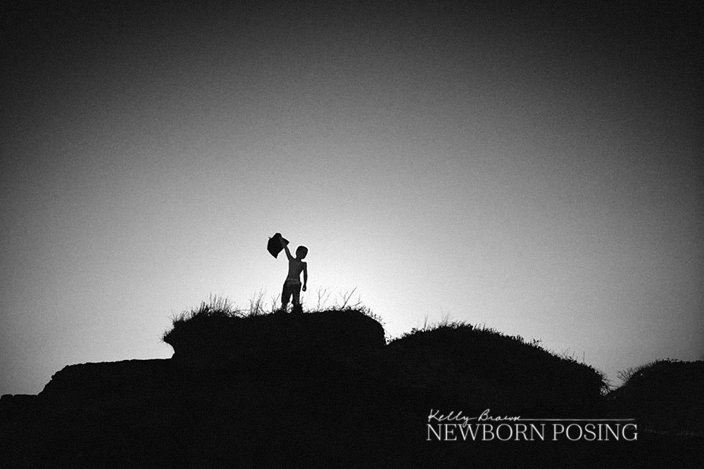
Despite the lack of depth, the shapes in these silhouettes are clearly defined. The subjects stand out clearly against their environment. This is a perfect example of shape as contrast.

SHAPE AS PATTERN (& MORE!)

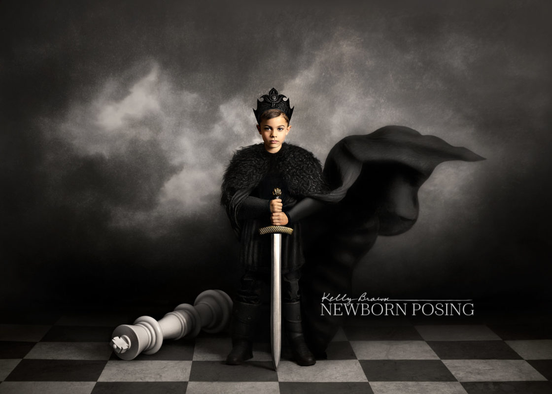
The checkerboard floor in this image consists of alternate black and white square shapes. These shapes encompass the design principles of pattern, as well as variety, repetition and rhythm.
Although it’s technically a Form (element) because the highlights and shadows give it depth, the organic shape of the boy’s billowing cape and the rigid geometric floor pattern balance (principle) against each other.
SHAPE ELEMENTS AS MASKS & FRAMES
Shapes can be used to mask an area of an image or define the boundary, such as in the case of adding a matt to a print, or an oval mask to a digital image.
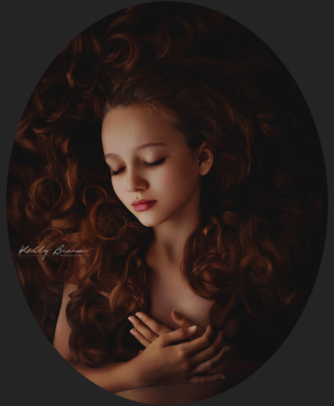
In these two images, the oval mask (above), and circular aperture of the frame (below) have been used to draw emphasis to the subjects.
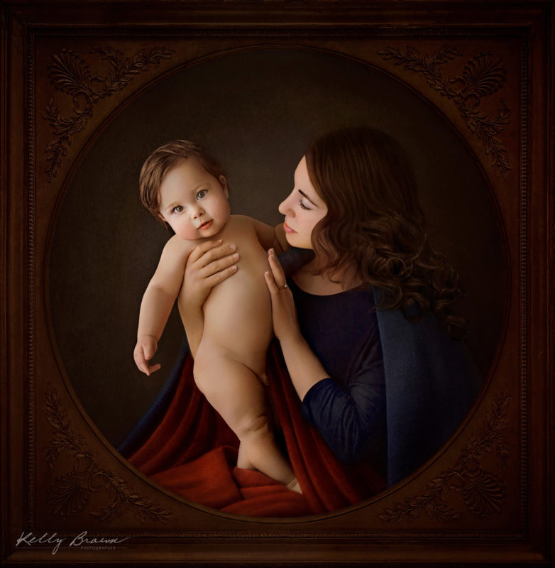
The colour and density of the frame have been chosen so that it remains a secondary object, balancing with the colours and tones of the primary portrait.
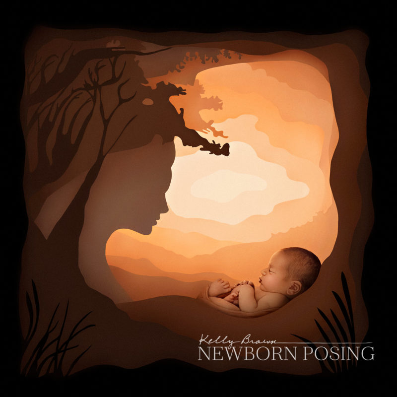
In this newborn portrait titled “Mother Nature”, Kelly Brown has used multiple cutout shapes to compose a creative scene which tells a story. Kelly has used light to create the tonal separations (element: value) between each of the shapes in the set.
Want to know more?
Expanding your knowledge of art theory will not only help you to create stronger images, but have a better understanding of peer critique. Whether during photography awards or giving online feedback, many experienced photographers will look for and reference the Elements of Art and Principles of Design, when critiquing images.
See our article on “Creating Images with Impact“.
You’ll find more articles on our series on the Elements of Art in our blog.
You might also like “Six Ways to Think about Shape” from the NY Times blog.

