We use colour in photography to create visual contrast, direct attention, evoke mood, and more. Of all the Elements of Art, colour is perhaps the most complex, but also, often has the most immediate impact.
Colour can impact our viewers’ emotional response to an image. It can draw attention to a subject OR cause it to get lost within the frame – either intentionally or unintentionally. The colours we choose and how we arrange them within the frame impact the effectiveness of our imagery.
In art theory, colour is one of the key Elements of Art, along with line, shape, form, texture, value and space. These elements are the building blocks of the images we create as photographers and artists, guided by the Principles of Design – balance, movement, pattern, repetition, rhythm, proportion, variety, emphasis, contrast.
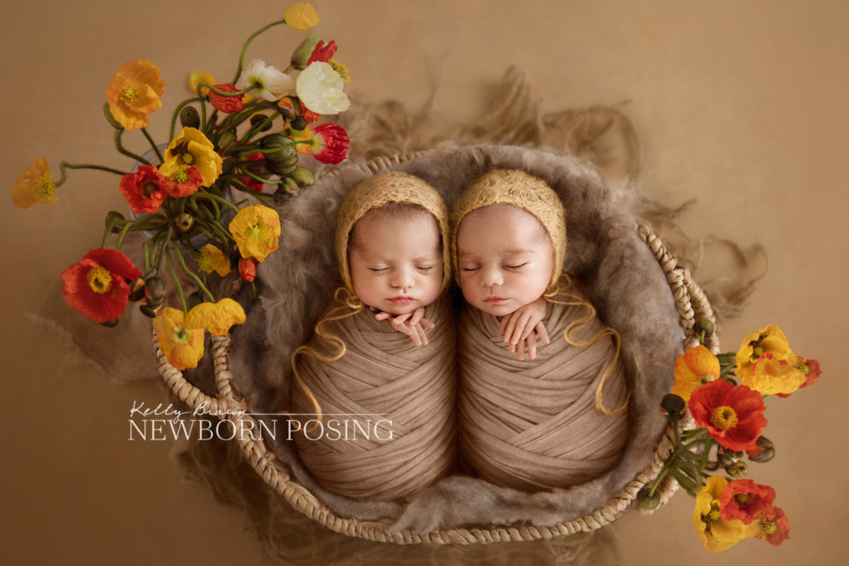
In Kelly’s image above, an analogous colour scheme (see below) has been used to create a harmonious colour palette. Compositionally, the colours (element) have been used in a way which creates a sense of balance (principle) and adds colour contrast (principle).
WHAT IS COLOUR?
When we talk about Colour in art theory, we often refer to its properties of HUE, INTENSITY and VALUE.
HUE – Hue is what we’re commonly referring to when we think of “colour”. It’s the colour family, if you like. eg. red, purple, green, etc.
INTENSITY – The intensity of a colour refers to how vibrant it is. A highly intense colour is bright and saturated, while a low intensity colour is more muted or dull.
VALUE – Value refers to how light or dark a colour or hue is. Consider the tonal scale from white to black with all the grey values in between.

Above: When the hues, intensity and values within an image are similar, there is no strong point of interest. But by using contrasting values (brightness levels) and/or complementary colours, we create greater impact and direct the viewer to the most important element within the frame.
USING COLOUR IN PHOTOGRAPHY
COLOUR SCHEMES
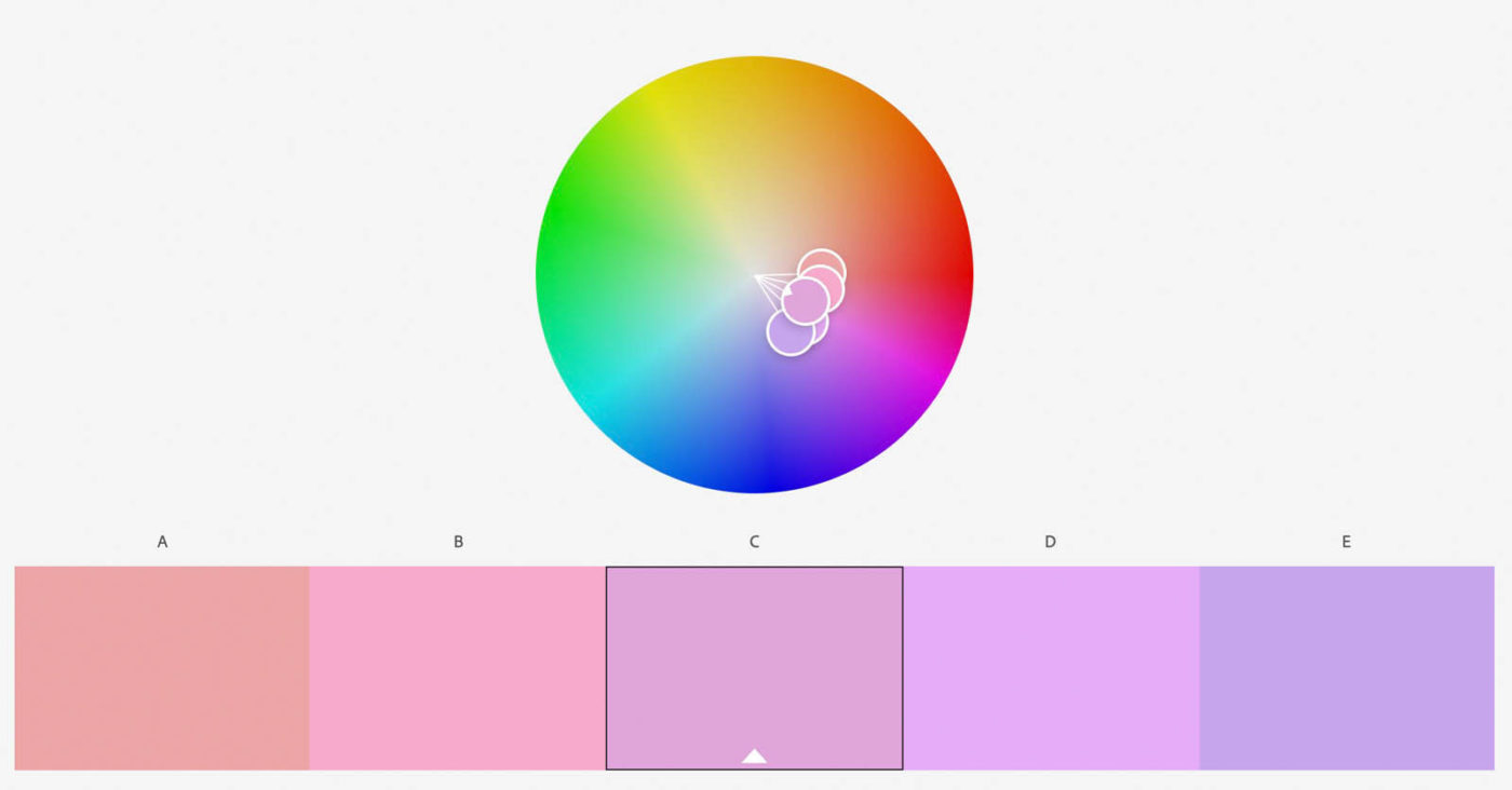
Whether you are styling a newborn session or looking for a dynamic landscape to photograph, colour is often one of the most dominating elements in the frame. To look at how (or if) colours work together, we can explore Colour Schemes. A Colour Scheme – or Colour Harmony – refers to how colours are put together, and their relationships on the colour wheel. These are just a few examples.
Monochromatic
- Literally means one (mono) colour (chroma). A monochromatic colour scheme consists of a range of values and intensities of one colour.
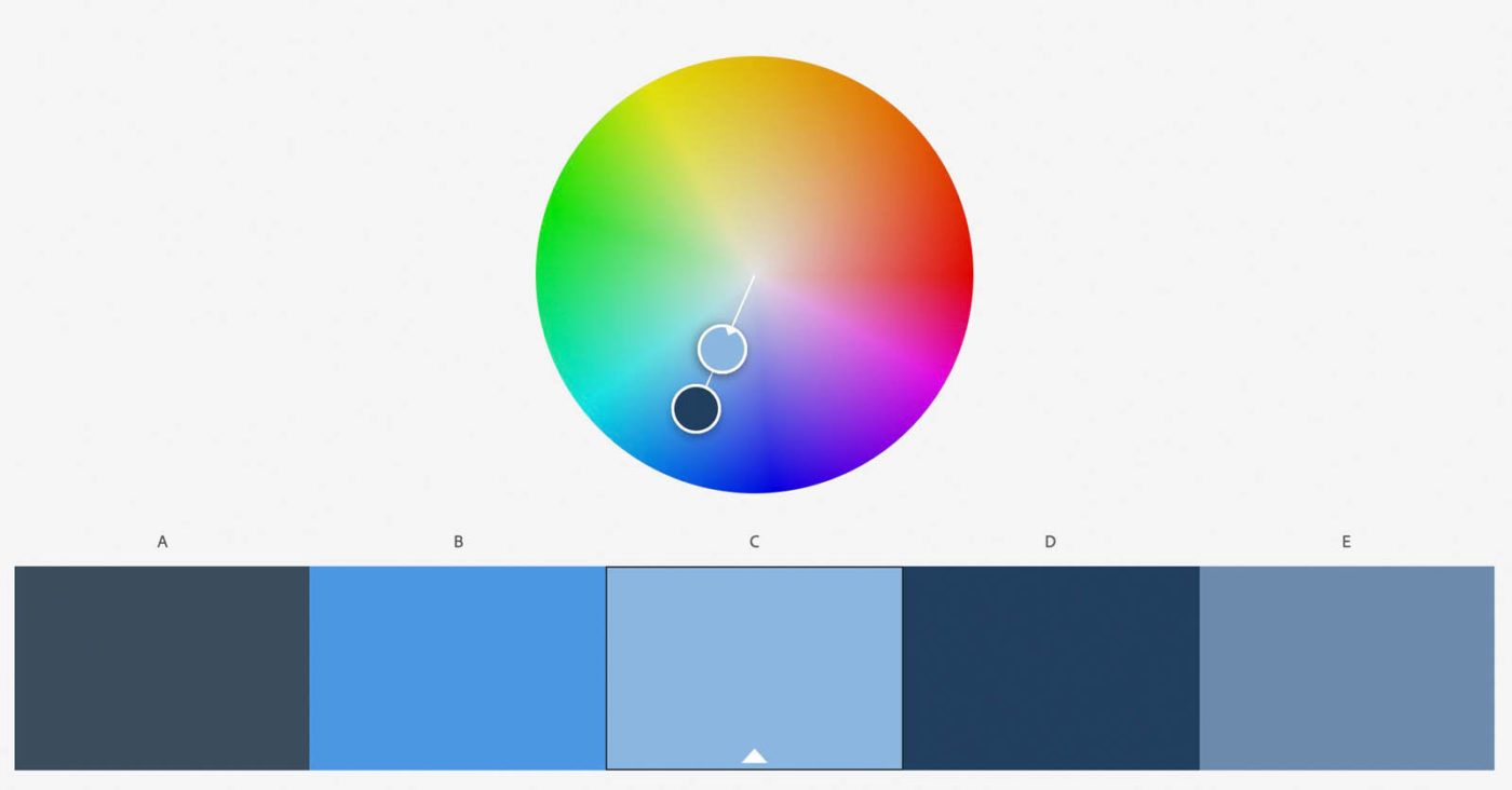
Analogous
- Analogous colours sit next to each other on the colour wheel.
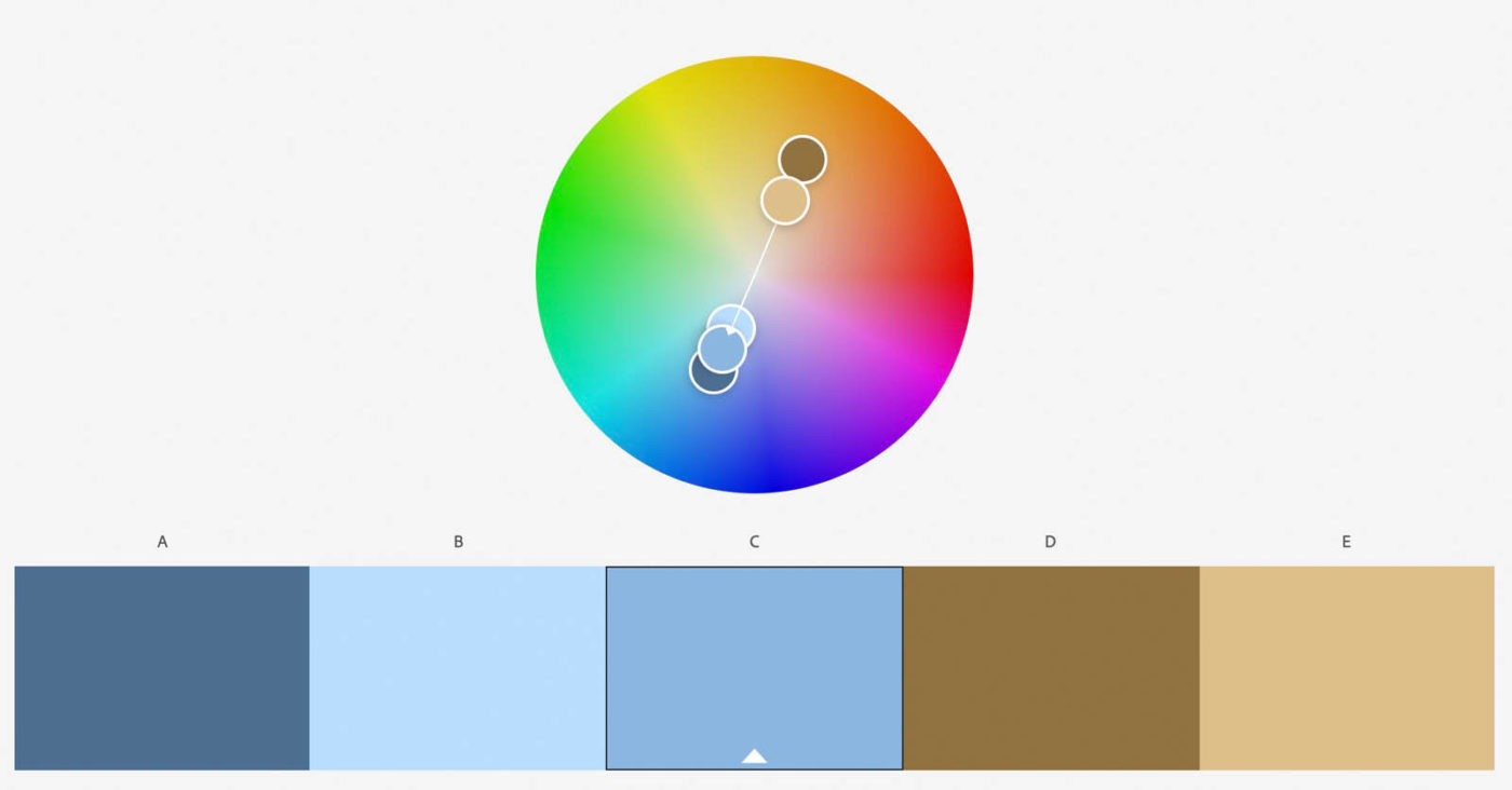
Complementary colours
- Complementary colours are directly opposite each other on the colour wheel. They provide strong contrast. Using complementary colours is an effective way to hero your subject within a frame, whilst using harmonious colour palette.
Triadic colours
- Colours in the triadic colour scheme are evenly spaced around the colour wheel.
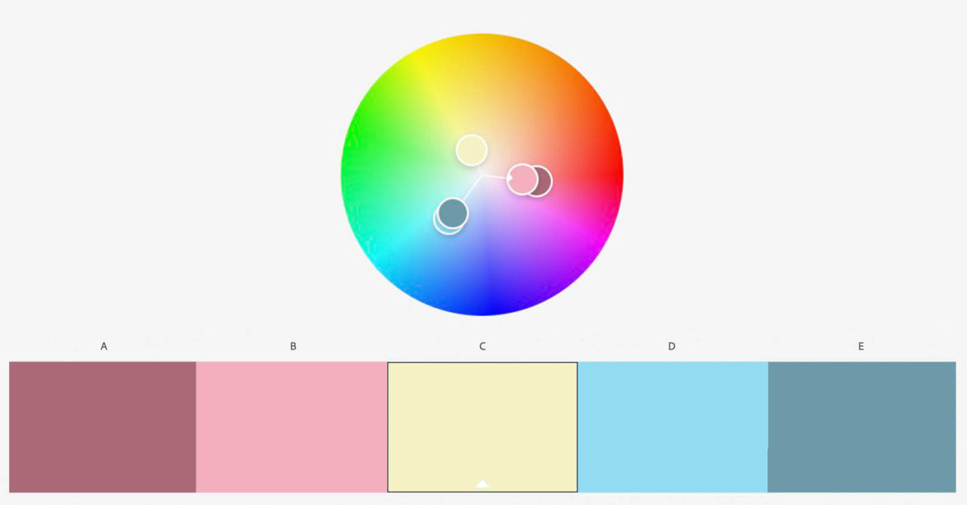
We can create balance by referring to colour harmony / colour scheme theory. Conversely we can create tension with colours which fall outside these harmonious schemes. Used well, a colour’s hue, value and intensity can draw attention to subjects and objects within a scene, and establish a sense of hierarchy, without competing for attention with the subject.
PSYCHOLOGICAL RESPONSE TO COLOUR
We can also use colour to create psychological responses, to help build a narrative or portray abstract concepts. For example, moderate warm (red, yellow, orange) colours are often associated with feelings of comfort and security. However, intense warm colours can also be seen as aggressive, which is why vibrant reds and yellows are often used on warning signs.
Subtle cool palettes (blue, green and cool purples) can evoke a sense of calm and restfulness, while muted variations of the same palette can add tension or instability, creating a sense of unease. Consider how cold skin-tones make you feel.
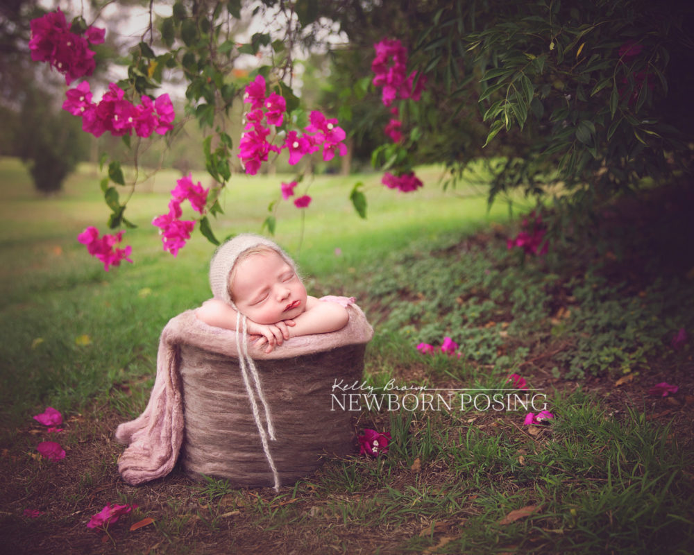
Colour can be used to unify or divide a frame. Intense, vibrant colours are often considered loud and bold. Subtle, muted palettes are generally softer, demanding less attention. This is why vibrant, saturated colours can often compete for attention within a photo. When colours compete with your subject, they draw your viewer away from engaging with subject and their story.
Elements of Art – Colour
Colour is a complex element and there are many areas you can research in greater detail, including the psychology of colour, colour harmonies / colour schemes, colour theory, and more.
As you explore images, past and future, take some time to consider how colour can be used to convey any of the Principles of Design – balance, movement, pattern, repetition, rhythm, proportion, variety, emphasis, contrast.
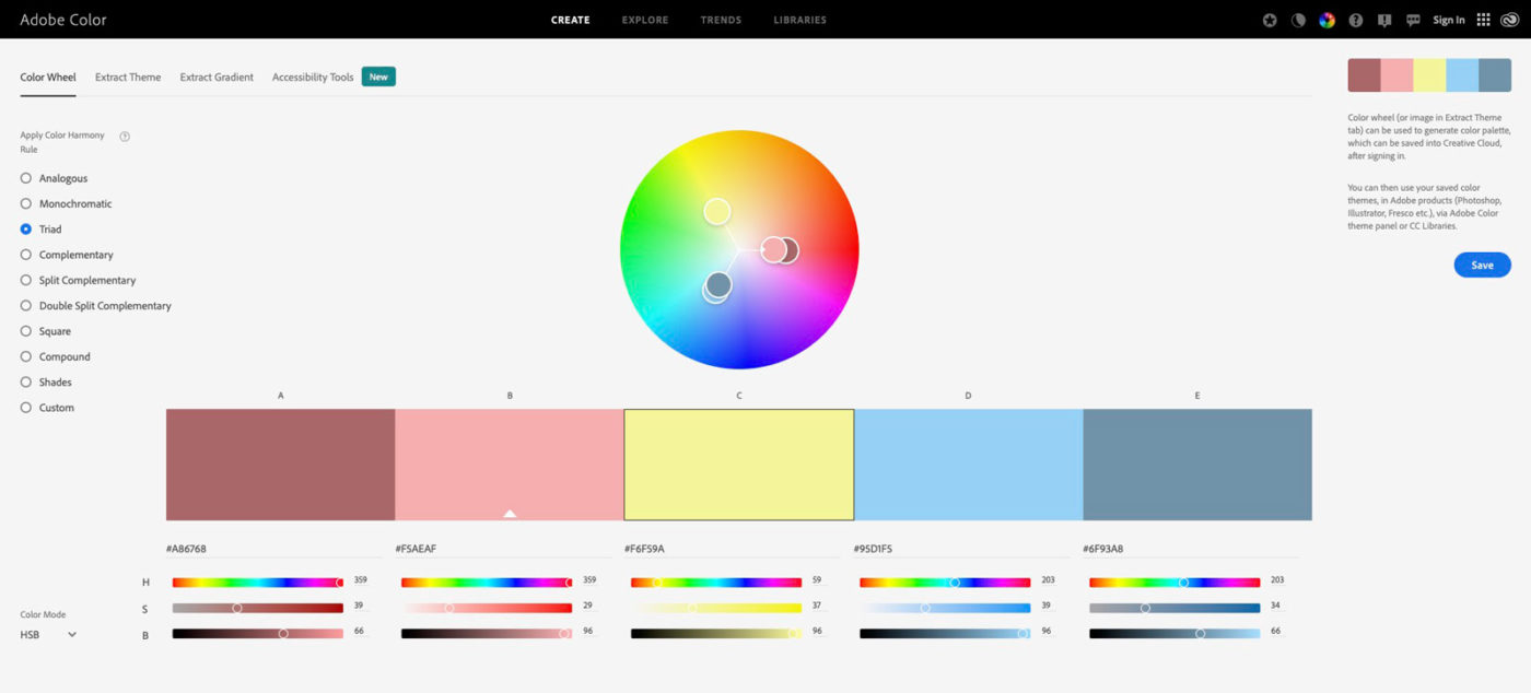
If you’ve not already discovered Adobe Colour, take some time to explore their colour wheel, features and trends.
You might also like Creating Images with Impact, where we discuss the role of the Elements of Art and Principles of Design in photography.


Robert van Hall says
I really have to dig into this subject, a very important factor in how your photo is percepted by your audience. Thank you Kelly!
Daniel says
Thanks very much for this great explanations. What would be also great, if you coult do an article about how to use this in real life shootings.
daniel
Sherry says
This is such a valuable blogpost. I will now be using a color wheel in my planning.
Sherry says
This is such a valuable blogpost.