We’re continuing our series discussing the Elements of Art, to help us create stronger images which connect with the viewer. This article explores VALUE, which is the lightness or darkness of an object or colour. You may also recall that we touched on VALUE back in our article on COLOUR which you can revise here.
We can use Value to express the Principles of Design. These include balance, movement, pattern, repetition, rhythm, proportion, variety, emphasis, contrast. Understanding these Elements and Principles helps us to improve the visual organisation of our images. This allows us to create stronger pieces of visual communication.
Using Value & the Principles of Design in Photography
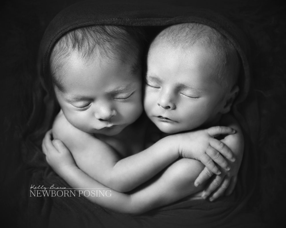
Note the differences in value, controlled by both lighting and styling, in this image of the twins. There is visual contrast (principle) between the subjects and the fabrics. This has drawn emphasis (principle) to the subjects. There is a sense of balance (principle) as the darker border draws the eye to the babies.

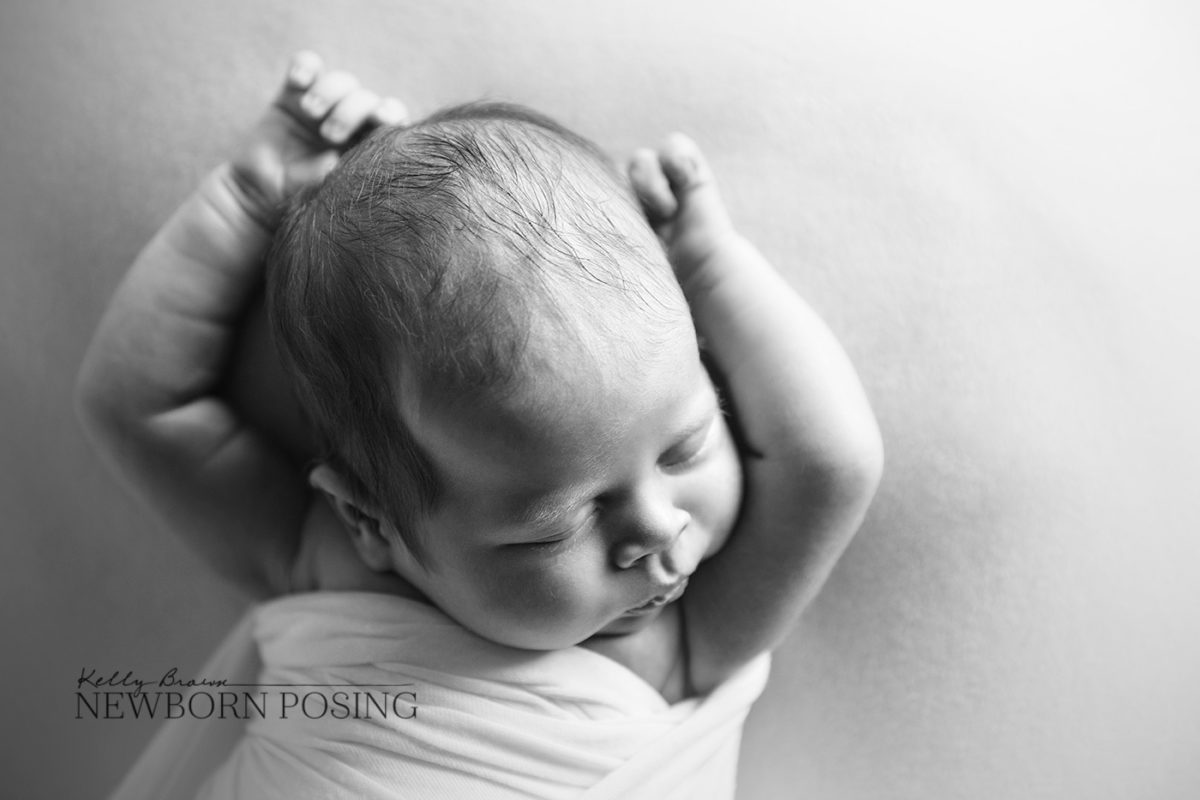
The image below shows how controlling light can create the illusion of depth through contrast (principle). The lighting has created values which fall in the shadow, midtone and highlight range. The result is a three-dimensional feel due to the direction and quality of light.

Elements of Art – Value
This Value Scale displays a range of values from dark to light. Painters and illustrators might create a value scale as a reference for defining and organising values in their artwork. Using the value scale helps them create the illusion of depth in their two dimensional artworks, with highlight and shadow.

As photographers, you probably refer to this as tonal scale. This scale has been broken into 3 sections, identifying the darker shadow tones, mid-tones, and brighter highlights. Much like painters and illustrators, photographers aim to replicate tones on the scale by controlling how and where light falls.
When all tones in an image fall within one of these 3 sections, the image is often considered flat. When an image includes tones in both the highlight and shadow areas, the image is deemed to have more contrast.
By controlling light to ensure shadow and highlight are present in the right areas, we can create the illusion of depth in our photographic work.
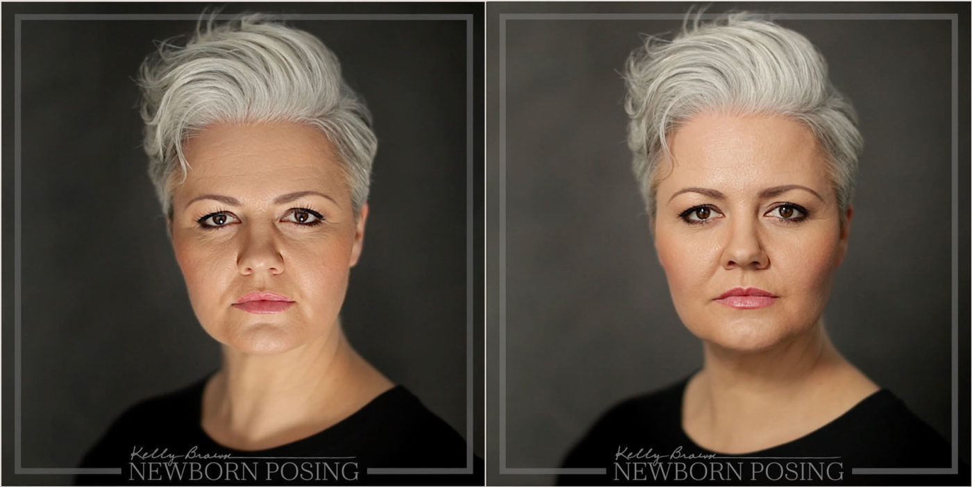
In this video you’ll see the impact of changing the position and direction of light. Note how Kelly’s face shape changes as the light moves. As the light position changes, different features become more/less emphasised.
Note not just how the light is falling across Kelly’s face, but how the density of the background changes. When less light falls on the background, throwing it into the shadow range of values, we see greater separation between subject and background.

These are examples of how we use the Value, by controlling light to create contrast, balance, and emphasis (principles).
Using Value in Design
As a business owner, it’s important to have some visual communication skills. Whether laying out marketing material, creating social media graphics, or designing model calls, art theory helps you communicate clearly.
In design, we can use differences in value to create contrast, to draw emphasis to an area. We can also use value to create hierarchy, visually indicating whether something is more or less important.
Here are a few examples of how using Value can help deliver your message more effectively.
Using Value (Element) to create Contrast (Principle)
The text on the left is difficult to read as there is little for it to contrast against clearly. On the right, we’ve used a solid colour block for contrast and emphasis (principles). This creates separation from the photo image, and points the viewer to the most important message first.

Using Value (Element) to create Hierarchy & Emphasis (Principles)
The examples below show how differences in value can be used to communicate hierarchy amongst the lines of text.
The graphics on the left in both examples show equal weighting to all text. Nothing stands out as more important than anything else.
When we vary the values, we create emphasis and an order of importance.
In the dark purple example, note the brightest text is dominant against the dark background, as the contrast is greater.

In the light blue example, note the darker text is dominant against the light background. We have also varied the scale of the text on the right, to further the point.

Whilst not amazing examples of design (!) these graphics show how value can convey contrast, emphasis and hierarchy. In these very simple mockups, we want to grab the attention of people with newborns. And we want to ensure they know how to contact us. Once engaged, they can then read the remainder of the information and make a decision on whether to contact us.
Conclusion
All of the elements and principles in this series should be considered in both your photography and design work. Many of them will be intuitive – in fact, you’re probably already applying them. Others take time and practice.
Start by observing and analysing things around you. Look at ads and photos in magazines, music album covers, posters and brochures in your community, and so on. Or you could visit a virtual gallery from the convenience of your smartphone to browse the work of the masters.

