How do YOU use the Type tool in Photoshop?
Photoshop’s Type Tool is often underestimated, yet offers a tonne of potential to creatives and small business owners. There are many uses for text in Photoshop, from social media graphics to creating client documentation. And, of course, designing custom wall prints for your clients.
HOW DOES THE PHOTOSHOP TYPE TOOL WORK?
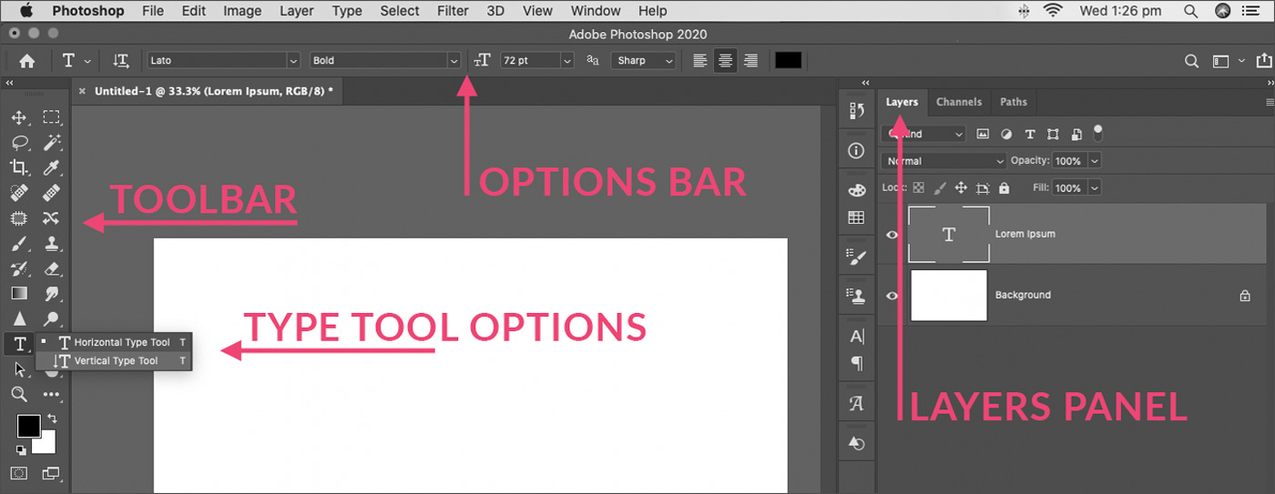
The Type Tool is located on the toolbar, indicated by the “T” icon. Like many other tools on that bar, you’ll find additional options when you click and hold the icon. The Type tool offers both horizontal text and vertical text tools.

Each time you add new text to your Photoshop document, a new Type layer appears in your Layers panel*. Type layers are identified by the “T” icon to easily distinguish between Type and other layer varieties, such as adjustment and image-based layers. *You’ll find the Layers panel under Window > Layers.
TIP: The small arrow in the bottom right corner of any Photoshop toolbar icon indicates more options are available for that tool.
If you are new to Photoshop, check out our article on “Photoshop Tips for Beginners – Photoshop Workspace“.
SINGLE TEXT LINE VS TEXT BLOCK
You can add text as a single line by clicking with the Type tool, anywhere within your canvas. This will allow you to create one long line of text.
Alternatively, you can define a block area for your text by clicking and dragging a rectangular shape. Your text will sit within this block. To change the size of the block, simply click back inside with the Type tool, and drag the handles which appear.
To edit your text, you’ll need to identify the required layer, and, with the Type tool active (selected from the toolbar), click within the existing text to make changes.
CUSTOMISING TEXT IN PHOTOSHOP
Once you’ve added a new type layer, you will need to customise the properties of your text to maximise readability and apply your design style.

The basic Type properties will appear in the Options Bar (shown), only while the Type tool is selected. For greater customisation, the Character and Paragraph panels offer more control. Find these under Window > Character and Window > Paragraph.

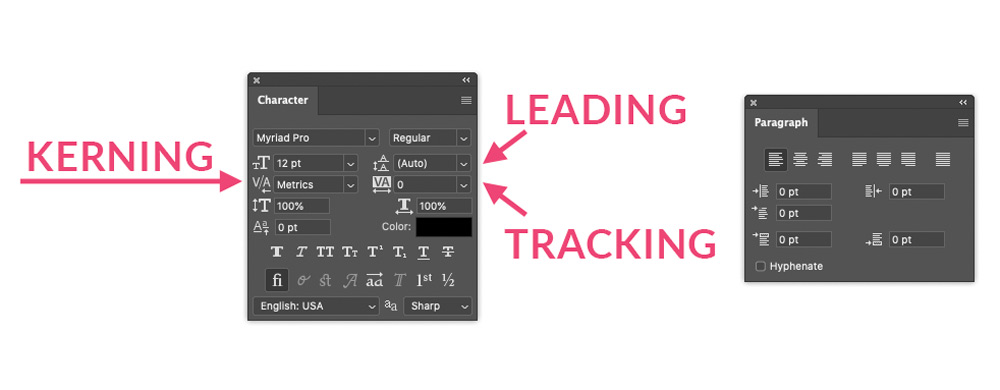
Use the Character window to select your font family and weight, font size and colour. This window also offers “faux” characteristics for fonts which are designed with limited options. Use the faux characteristics to add “fake” italics, bold, strike-through, and so on.
The Paragraph window offers formatting options for text blocks. These include justification (left, right, centre, full), paragraph indentation, and hyphenation options.
To further improve legibility, work with the leading, tracking and kerning options, to control the space between words and characters.
WHAT IS TEXT LEADING?
Leading is the space between lines of text. It might not sound overly important, but it’s one of the main properties which determines the legibility of your type.
Tight leading can make large paragraphs of text difficult to read. Too loose, and paragraph text can look disconnected. However, loose line spacing in a heading or a quote can be visually appealing, making it easy to read, particularly at the speed we scroll through social media.
Interesting fact.. The term leading is used because traditional print typesetters used blocks of lead between lines of text to define the spacing!
WHAT IS TYPE TRACKING?
Tracking refers to spacing between characters. InDesignSkills defines it as “tracking adjusts the letter-spacing uniformly over a range of characters”. This definition helps to distinguish tracking from kerning, below, which also relates to character spacing. You can read more in their article.
WHAT IS KERNING?
Kerning adjusts the space between individual characters to maximise legibility. Kerning is quite fiddly, so would be reserved mostly for logo, headline or poster text, more than body text. Read more.
MOVING A TYPE LAYER IN PHOTOSHOP
To reposition text, click to select the relevant layer. Choose the Move tool from the toolbar. Click and drag to reposition the text elsewhere within your canvas. See the tutorial video above for a demonstration.
TIP: We recommend turning Auto-Select OFF in the Move tool properties when moving text. As text is often fine, auto-select may choose a different layer within your image, making it difficult – and frustrating – to move the desired type layer.

CAN I RESIZE TEXT IN PHOTOSHOP WITHOUT LOSING QUALITY?
Type is added to a Photoshop document as a vector shape. Vectors are mathematical expressions of lines, curves and colours to define how a shape (text characters in this case) should appear. Vectors are NOT made up of a defined number of pixels, therefore, when resized, there is no quality loss.
WHAT IF I RASTERISE MY TEXT LAYER?
If you “Rasterise Layer” your vector text will be converted to pixels, just like an image. You will no longer be able to edit the text, and any changes to size via Transform will result in loss of quality and sharpness.
Unless necessary, we recommend avoiding rasterising type layers, without at least first checking that no edits will be required.
APPLYING PHOTOSHOP LAYER STYLES TO TYPE
In addition to the properties shown above, you may also apply Photoshop’s Layer Styles to text. Layer Styles are accessed via the bottom of the Layers panel (see the FX icon) and include effects such as drop shadows, colour and pattern overlays, stroke and more.

The video below, also included with the Social Media Templates, demonstrates how Layer Styles can be used to customise Type layers or Layer Groups containing multiple layers of text.
WHERE DO I GET FONTS TO USE IN PHOTOSHOP?
Like many creative assets, many fonts are subject to copyright and licensing. If you are using them for your business you will likely need a commercial license. This is a worthwhile investment for your brand.
If you are an Adobe Creative Cloud subscriber, you will likely have access to Adobe Fonts (previously known as Typekit). This gives you access to a large library of professionally designed, licensed fonts.
The video below demonstrates how to search and synchronize Adobe Fonts to your Adobe applications. If you are using Adobe Spark on your iPhone or iPad, you can also access your Adobe Fonts there for more creative options for your social media graphics!
CONCLUSION
While most of us think of Photoshop as a photo editing tool, it also has uses for graphic design. As small business owners, it’s important to have at least a small range of design skills under your belt.
We recommend you spend some time observing how text is laid out in magazines, posters, and so on. Pay attention to colour, size, spacing, proximity, heirarchy, pattern and other design principles.
Behance is filled with design inspiration!
Take note of what you do and don’t like, and start applying these principles to your own use of type.

